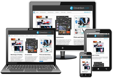
Responsive Web Design
These days, many people spend as much or more time searching the web on mobile devices as they do on desktop monitors or laptops. The last thing your customers want to do is spend a lot of time scrolling to get see an image or to read text that extends beyond the screen width.
Think your customers are not using a smaller screen to view your site? Think again. It has been estimated that Internet browsing on smart phones and tablets will surpass desktop/laptop browsing by 2014.
A responsive site is not a separate mobile site that has to be maintained and updated with your non-mobile site. That strategy just makes more work for everyone. A truly responsive site takes the same content and resizes / repositions everything so it looks great on any size screen: Text is still readable, images resize automatically to fit the screen.
Responsive Web Site Redesign
We can take your existing web site and rebuild it to look great on any size screen. It’s not a simple project, but it is one which will provide benefits year after year.

Site maintenance costs are low
- Consistent brand identity
- Responsive web sites are user friendly
- Fast load times
- Google likes it
- Google likes it
- All of your customers see your whole web site
- Your site looks great
With more and more of your customers purchasing products using their smartphones and tablets it seems that responsive web design is the logical step forward for web sites. You can meet the needs and requirements of your customers, whether they are shopping on-the-go or from the comfort of their own living room. If you want to take advantage of all the benefits responsive web design has to offer: